Prototype


About the project
Calenda is a fun and interactive calendar app that I’ve designed. It started as a personal project, but quickly showed the potential and path towards development.
My role on the project
In this project, I was the main designer and my role involved the research, iterations, final high fidelity screens, a full prototype, and a landing page. I also partnered with a Director of UX for additional processes, research avenues, and feedback.
The problem
Today, many people use calendar apps on a daily basis.
The problem is, that many of them are not very exciting, they tend to lack colors and visual aspects, and don’t provide unique and fun interactions with an overall great experience.
Full daily agenda
The focus of this interaction was to provide the user with a full view of their entire daily agenda in one specific place. I wanted the user to simply be able to scroll up and down to view their entire daily tasks.
Adding an agenda
In this interaction, I wanted to create a seamless transition between the screens to facilitate the task of adding an agenda most easily and effectively.
The final designs
As part of addressing the most
important features of the app,
I moved forward to design
the rest of the screens.
Landing page
To showcase the final product, I decided
to promote the Calendar App in the form
of a Landing Page, highlighting all its
unique features.
Solutions
This provided an opportunity to solve these issues and design a modern, colorful, and fun calendar app that has unique interaction features all in one convenient place.
Results
This project was very interesting to think of and design. Although I tried to package it and move forward with development, I was lacking some of the resources to accomplish that. It did present a great learning opportunity, and I’m hoping to make improvements and revisit it at a later time.
Main takeaways
This experience allowed me to see and understand how to go about designing a full product from A to Z and take all the consideration while thinking carefully about each decision as I went through the process. I've learned much of the importance and significance of animation and interaction that goes into a product such as this.
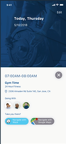
In this interaction, I wanted to allow for more visibility for each agenda box. Once tapped on, it will expand to reveal the entire information. Also, I wanted to provide the user with easy access to navigating to the desired location by embedding both Waze and Google Maps buttons.
Thanks for watching!
If you’d like to collaborate and work together on cool ideas, comment, or simply connect to say hi, please drop me a line at mduncanlane@gmail.com